~ 4 min read
Building an accessible icon button
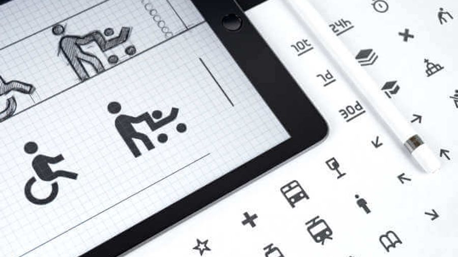
Why we use visually pretty buttons
Buttons are an essential part of user interface design, and they provide an intuitive way for users to interact with digital products. However, buttons are not always designed with accessibility in mind, and this can create barriers for people with disabilities. One common issue is the use of font libraries like Font Awesome, which can be fast to implement but create slower apps and make buttons inaccessible to screen readers. In this post, we’ll explore how buttons should work for all and suggest a compromise that enables icons without needing to hide them from screen readers.
Buttons should be accessible to everyone, regardless of their abilities. This means that buttons should be designed with accessibility in mind, which includes using meaningful text labels, providing visual cues, and ensuring that buttons can be activated using a variety of input methods. However, buttons often rely on icons to convey their function, and this can create challenges for people with visual impairments who use screen readers.
Font libraries like Font Awesome are a popular way to add icons to buttons quickly, but they have a significant drawback: they rely on web fonts to display the icons, which can slow down page loading times. Additionally, because these icons are not part of the text, screen readers may not be able to recognize them, making buttons inaccessible to people with visual impairments.
To create buttons that work for all, we need to find a compromise that enables icons without compromising accessibility. One approach is to use SVG icons instead of font icons. SVG icons can be embedded directly into the HTML or encoded in CSS, which means they don’t require web fonts to display. This can help speed up page loading times, and it also makes the icons accessible to screen readers.
Design systems leverage libraries
However, using SVG icons can create challenges for developers who need to manage a large number of icons. To address this, some companies have created icon libraries that provide pre-built SVG icons that can be easily added to buttons. For example, Google’s Material Design library includes a range of SVG icons that can be used for buttons, and they are designed with accessibility in mind.
Another approach is to use a combination of text and icons to convey button functionality. For example, instead of relying solely on an icon, a button could include text that describes its function, with an icon used to provide a visual cue. This approach can help ensure that buttons are accessible to screen readers while still providing a clear visual representation of their function.
Below is a code sample represented in recent work on a design system. My recommendation to the team was to do this hard work in the design system to make implementing the design easier for web developers, who only wanted CSS classes for their React frontend. I argued that adding FontAwesome inside some HTML works fine, but linking the FontAwesome font adds weight to the application when we used only a small part of it. Adding SVG code within HTML adds code most people want to ignore. Therefore, adding encoded SVGs as background images do not cause trouble for screen readers and do not exist in the HTML.
<!-- HTML -->
<code class="language-html" data-lang="html">
    <button type="button" class="outlined-btn-sm bg-icon-o-clock" onclick="alert('something')" >Button</button>
</code>
// Modular SCSS
// clock -- usage as waiting for response
$clockIcon: "data:image/svg+xml,%3Csvg width='18' height='18' fill='none' xmlns='http://www.w3.org/2000/svg'%3E%3Cpath d='M9 1.5A7.499 7.499 0 001.5 9c0 4.143 3.357 7.5 7.5 7.5s7.5-3.357 7.5-7.5S13.143 1.5 9 1.5zm0 13.548A6.047 6.047 0 012.952 9 6.047 6.047 0 019 2.952 6.047 6.047 0 0115.048 9 6.047 6.047 0 019 15.048zm1.869-3.157l-2.568-1.866a.365.365 0 01-.148-.293V4.766c0-.2.164-.363.363-.363h.968c.2 0 .363.164.363.363v4.285l2.02 1.47a.363.363 0 01.079.508l-.569.784a.365.365 0 01-.508.078z' fill='%23#{str-slice(#{theme.$foreground-white-color}, 2)}'/%3E%3C/svg%3E";
$outlineClock: "data:image/svg+xml,%3Csvg width='18' height='18' fill='none' xmlns='http://www.w3.org/2000/svg'%3E%3Cpath d='M9 1.5A7.499 7.499 0 001.5 9c0 4.143 3.357 7.5 7.5 7.5s7.5-3.357 7.5-7.5S13.143 1.5 9 1.5zm0 13.548A6.047 6.047 0 012.952 9 6.047 6.047 0 019 2.952 6.047 6.047 0 0115.048 9 6.047 6.047 0 019 15.048zm1.869-3.157l-2.568-1.866a.365.365 0 01-.148-.293V4.766c0-.2.164-.363.363-.363h.968c.2 0 .363.164.363.363v4.285l2.02 1.47a.363.363 0 01.079.508l-.569.784a.365.365 0 01-.508.078z' fill='%23#{str-slice(#{theme.$primary-300}, 2)}'/%3E%3C/svg%3E";
// usage: written as bg-icon-*
.bg {
background-position: 50%;
background-repeat: no-repeat;
border: 0;
box-sizing: content-box;
margin-right: 0.3rem;
padding: 0.6rem;
&-icon {
&-o-clock {
@extend .bg;
background-image: url('#{$outlineClock}');
background-position: 1.1rem;
padding: 0.75rem 1.4rem 0.75rem 2.6rem !important;
}
}
}
In conclusion, buttons are a critical component of user interface design, but they must be designed with accessibility in mind to work for all users. Font libraries like Font Awesome can create fast, but slower apps and make buttons inaccessible to screen readers. By using SVG icons, combining text and icons, or using pre-built icon libraries, we can create buttons that are both accessible and functional. Let’s work together to create buttons that work for everyone.